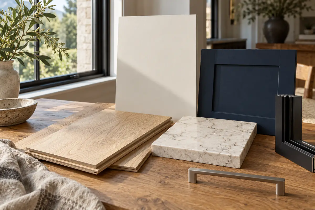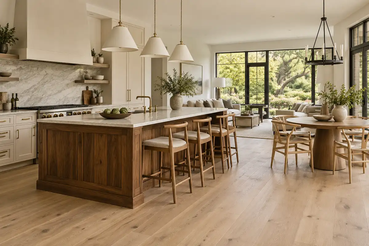
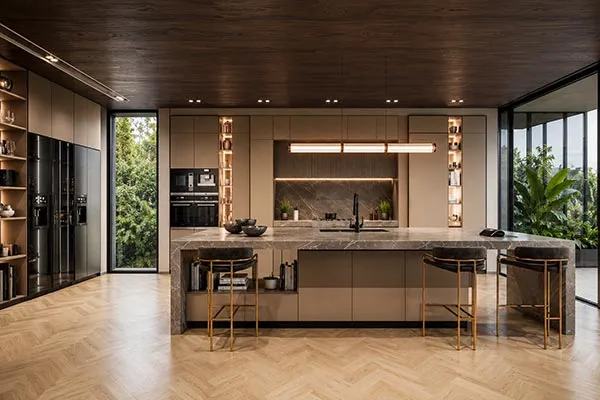








You love the oak floor, the creamy stone, and the cabinet sample. Then you put them together, and something feels off. The problem may not be any individual choice. It may be how those choices relate.
A whole-home color palette connects walls, cabinetry, flooring, stone, and window frames through a few repeated colors and finishes. We suggest starting with permanent materials, choosing a main neutral, and carrying selected accents between rooms. Your bedroom can feel quieter than your kitchen without looking like a different house.
For a US luxury home, that coordination matters more than adding another expensive finish. Here is a practical way to build it, room by room.
Start With the Materials You Will Keep
Before opening a paint fan deck, collect the finishes you have already chosen: flooring, countertops, window frames, doors, and furniture you plan to keep. These establish your starting point. Paint offers more flexibility than a large stone slab or a houseful of flooring.
For a new build, we suggest reviewing the main wood tone and stone together, then coordinating cabinetry and frames before finalizing wall paint. Adjust that order around products already approved or needed early for construction.
Look beyond names such as “white” or “gray.” A stone may lean creamy, pink, or cool gray. An oak finish may look honey-colored beside one wall and muted beside another. Compare actual samples, rather than assuming matching product descriptions mean matching undertones.
Choose one material to lead. If your stone has expressive veining, let nearby cabinetry and flooring provide a calmer background. If walnut joinery is the feature, simpler stone can give its grain room to breathe.
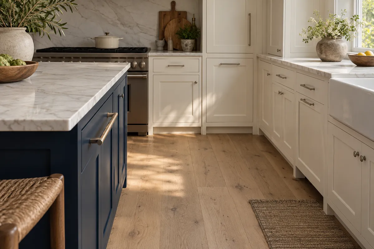
Connect Your Main Living Spaces With a 60–30–10 Palette
The 60–30–10 approach organizes a room into a dominant color, a supporting color, and accents. Treat the percentages as visual guidance, not a calculation of square footage.
- About 60%: the background, often walls, large upholstery, and some flooring.
- About 30%: supporting materials such as cabinetry, wood paneling, or substantial furniture.
- About 10%: smaller contrasts in textiles, art, lighting, and hardware.
Wood floors can belong to the supporting group; they do not automatically count as the dominant color. Hardware rarely fills 10% of a room, and it should not need to.
Repeat the same color family in different proportions. Navy might cover a kitchen island but appear only in a living-room cushion. As Benjamin Moore’s whole-house guide explains, a dominant color works alongside secondary, trim, and accent colors to create continuity.
Entryway, hallways, and stairs
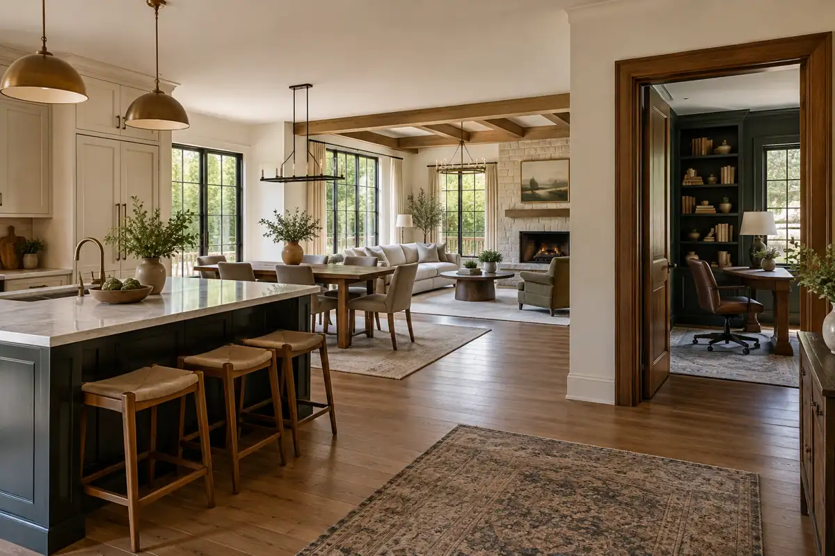
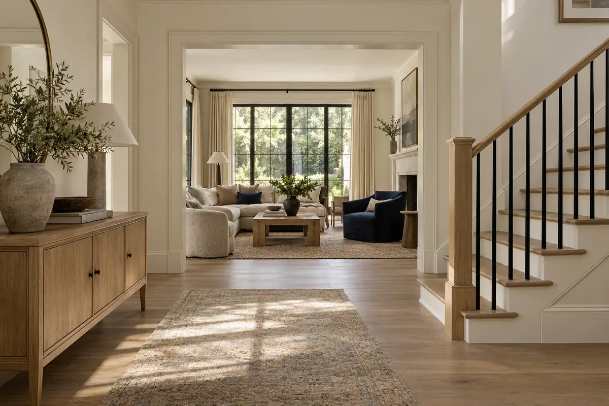
These connecting spaces introduce the rest of your home. Repeat your main wall or trim color, and coordinate stair treads with the nearby floor. They need not be identical, but an unplanned orange stain against pale oak can interrupt the connection.
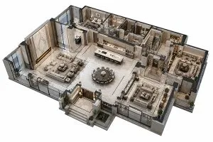
Stand at the front door and look into adjoining rooms. Judge the finishes visible together before deciding whether each room works alone.
Living and dining areas
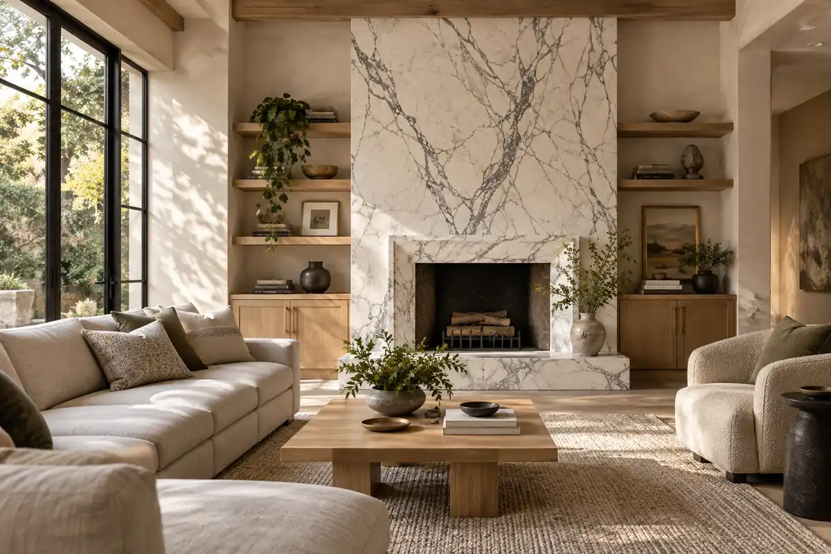
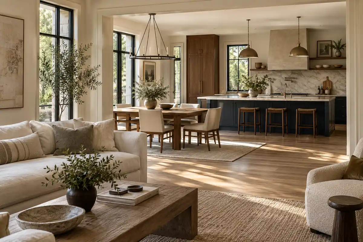
Use a shared wood tone, neutral upholstery, or repeated window-frame finish to connect open spaces. Add interest through woven fabric, grain, and stone texture rather than constantly introducing new colors.
White oak floors and walnut furniture can work together when the contrast is intentional. Repeat the darker wood elsewhere, such as a dining cabinet, instead of leaving one piece visually isolated.
Kitchen
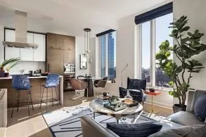
Review cabinet doors, countertop, backsplash, flooring, and frames as one group. Decide whether the island or the perimeter should attract attention. Strong veining plus several cabinet colors can leave too many competing features.
In Houzz’s 2026 kitchen findings, wood leads overall cabinet selections. Among contrasting upper-and-lower schemes, blue and green are notable lower-cabinet choices. That supports these options as inspiration, not a requirement to follow a trend.
Give Private and Practical Rooms Their Own Mood
Primary bedroom
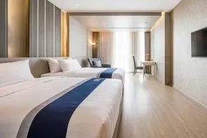
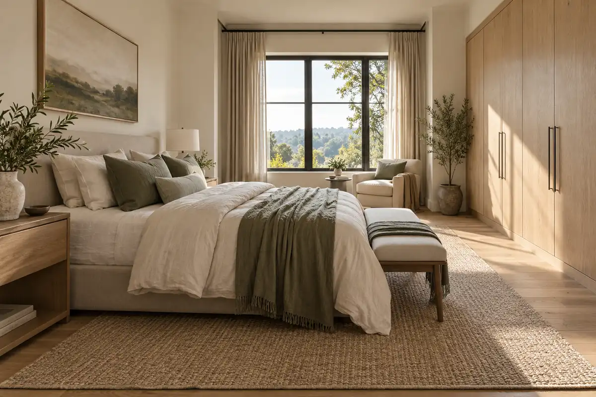
Carry over the main neutral or wood family, then soften the contrast. An oak wardrobe, warm white walls, and muted green bedding can echo a green kitchen without repeating its darker cabinetry.
Check large wardrobe doors carefully: they occupy enough visual space to influence the whole room, even when marketed simply as storage.
Bathrooms and powder rooms
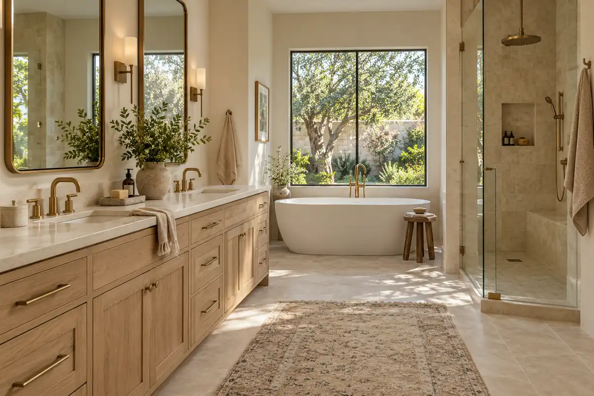
Connect the primary bathroom through vanity wood, stone undertones, or a familiar metal finish. Compare tile with the actual tub and sink; different whites can look unexpectedly different side by side.
A separate powder room can support a deeper wall color or stronger stone. Keep one connecting detail, such as door color or hardware, so the change feels deliberate.
Office, laundry, and mudroom
Repeat an established cabinet color or wood finish in built-in storage. A study can use richer tones, while a laundry room may feel better with a lighter background. Choose coatings and materials for their intended use as well as their appearance.
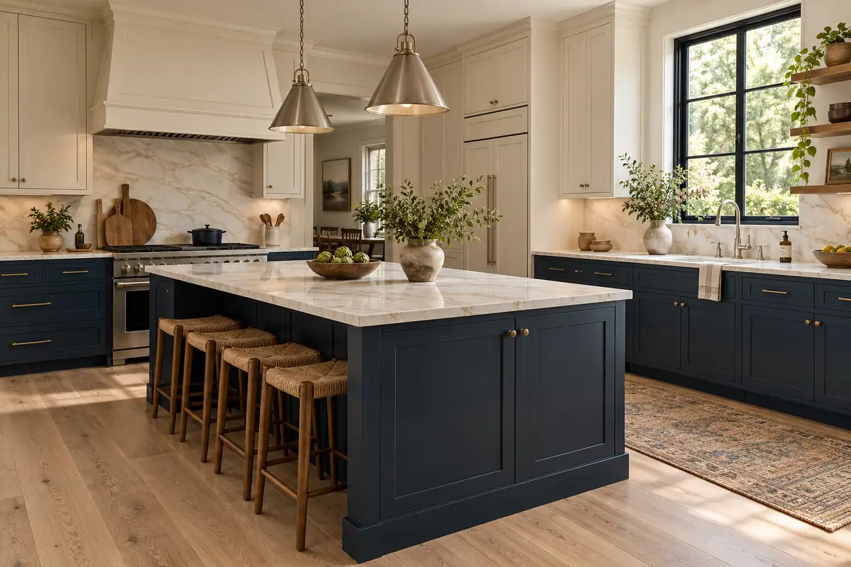
Palette 1: Warm White, White Oak, and Navy
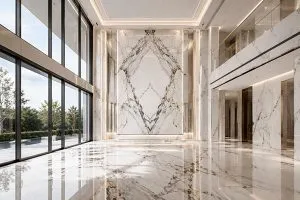
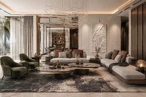
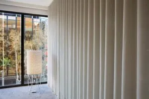
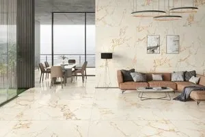
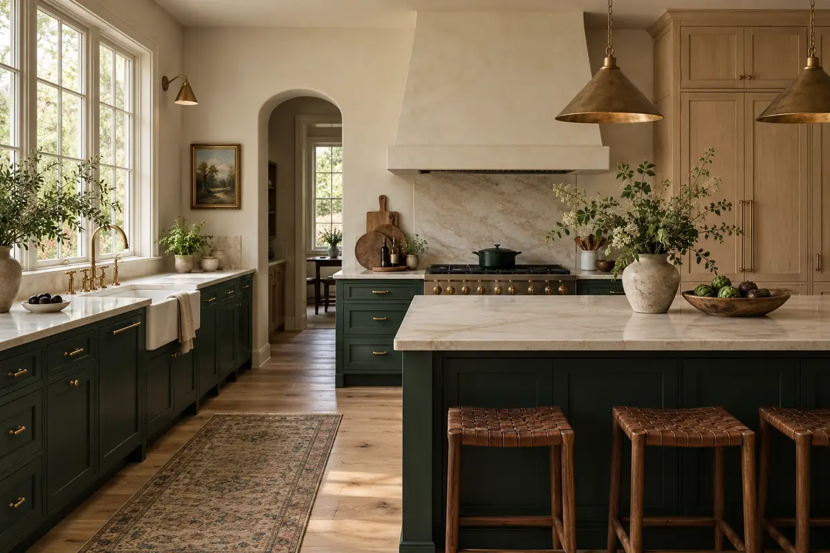
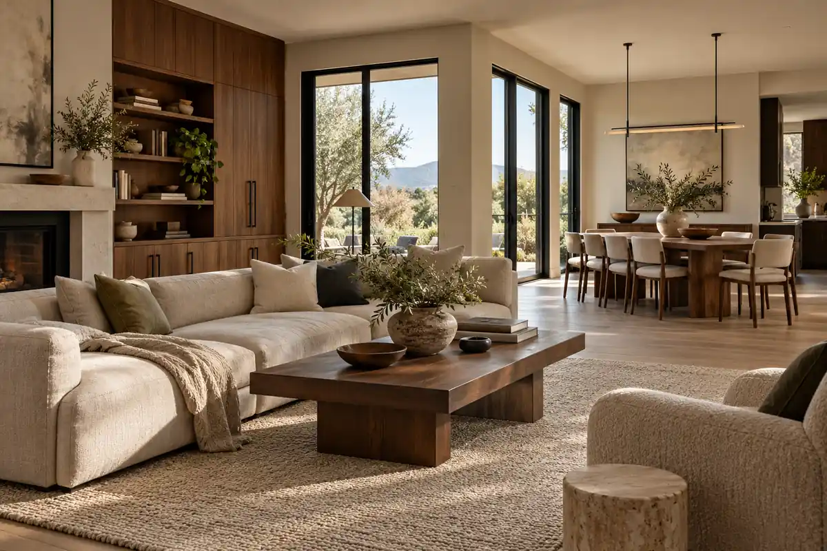
These are our suggested combinations, not official brand pairings or exact cross-brand matches. Use them to request physical samples. The illustrations show design ideas, not calibrated paint colors or completed George projects.
- Walls and trim: Benjamin Moore White Dove OC-17.
- Wood: natural-looking white oak flooring and selected cabinetry.
- Feature cabinetry: Benjamin Moore Hale Navy HC-154 as a color reference.
- Stone: warm white with restrained gray-beige veining.
- Frames: RAL 9005 Jet black; consider brushed nickel hardware.
Use navy on an island or lower cabinets, then repeat it lightly in living-room textiles. Keep bedrooms predominantly warm white and oak. Test whether the floor’s yellow tones become too strong beside the blue.
Palette 2: Warm White, White Oak, and Deep Green
- Walls: Benjamin Moore White Dove OC-17.
- Feature cabinetry: Benjamin Moore Essex Green HC-188 as a reference.
- Wood: pale white oak with a restrained finish.
- Stone: creamy white or light beige with quiet movement.
- Frames: RAL 9010 Pure white; consider a sampled brass finish.
Let the deep green anchor the kitchen, then use softer greens in bedding or artwork. Essex Green is very dark, so check a full cabinet-door sample in the room’s dimmest corner. Compare white frames with the wall sample rather than assuming they match.
Palette 3: Warm Greige, Walnut, and Black
- Walls: Benjamin Moore Pale Oak OC-20.
- Trim: test White Dove OC-17 alongside the wall color.
- Wood: walnut cabinetry, paneling, or selected furniture.
- Stone: warm white or light greige with controlled veining.
- Frames: RAL 9005 Jet black; specify matte black hardware separately.
Keep enough pale surfaces around walnut to balance its depth. Repeat walnut in a vanity or study cabinet, without covering every room in dark wood.
Verify paint references with Benjamin Moore, including Essex Green, and frame references with RAL. A RAL number identifies color, not sheen, texture, or coating performance. A cabinet coating matched to a paint reference still requires approval on its actual substrate.
Test Your Finishes and Resolve Common Questions
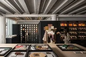
Bring the materials together in the home before placing the final order. Stand paint and cabinet samples upright, lay flooring flat, and position stone as it will be installed. Review them in morning light, late afternoon, and under your intended evening lighting.
Move the group between rooms. A palette that feels balanced near a large window may look quite different in an interior hallway. Phone images and renderings are useful for discussion, but should not become the color acceptance standard.
For coordinated purchasing, create a finish schedule with these fields:
| Record | Example |
|---|---|
| Room and surface | Kitchen lower cabinet doors |
| Color reference | Hale Navy HC-154 reference |
| Material and finish | Approved substrate, coating, texture, and sheen |
| Approval record | Physical sample ID, date, and approver |
Record wood species, stain, grain selection, and acceptable variation too. Natural wood and stone are not uniform printed surfaces. Keep approved samples available for production checks and installation decisions.
One-stop sourcing can simplify coordination across cabinetry, flooring, stone, and windows, but it does not automatically make different materials identical. We recommend one shared schedule and separate approved samples for each product finish.
Frequently Asked Questions
Should every room have the same wall color?
No. Repeat a few base colors or finishes, especially across open sightlines. Enclosed rooms can vary more while sharing trim, wood, or accents.
Can we mix white oak and walnut?
Yes. Choose a leading wood tone and use the second intentionally. Compare finished samples, since stain and sheen matter as much as species.
Should cabinets match floors or interior doors?
They should coordinate, but exact matching is optional. A clear contrast often feels more deliberate than two almost-matching wood finishes.
Can Benjamin Moore colors be converted directly to RAL?
Do not assume an exact equivalent. Use the named reference to discuss direction, then approve a physical sample of the proposed coating on the actual material.